
Designing for Depression: A UX Case Study
CareRoad is an app designed for people who suffer from Depression. This app will help therapists keep track of their patients’ progress, while helping patients feel supported and motivated.
The National Wellness Institute is an organization founded in 1977 with the mission of providing health promotion and wellness professionals with unparalleled resources and services that fuel professional and personal growth.
Problem
The NWI has seen a substantial drop in memberships, therefore, they want to find a way to add value to their members by creating a set of digital wellness tools for Wellness coaches and therapists.
Objective
Create a digital tool that falls under one of the Wellness categories designated by NWI that allows a coach or therapist to track the user’s progress and improve their well being.
Hypothesis
We believe that we will increase retention by offering an innovated digital tool to NWI members that they can use with their clients. This tool will aim to increase user’s engagement and satisfaction.
Metrics:
We will know we have succeed if :
-
We see an increase in membership retention
-
There is an increase on revenue
-
Clients start using the app
My role
UX and UI Designer.
Duration
2 week design sprint.

For this project we are going to focus in Emotional Wellness, one of the six dimensions of wellness recognized by the NWI. More specifically, we will design a digital tool centered on people who suffer from Depression.
Did you know that…
Depression in the United States…
-
Affects over 18 million adults (one in ten) in any given year.
-
Is the leading cause of disability for ages 15–44.
-
Is the primary reason why someone dies of suicide about every 13 minutes — over 41,000 people a year.
Available from https://www.hopefordepression.org/depression-facts/

Depression is a serious medical condition that is associated with symptoms such as melancholy, loss of pleasure, loss of energy, difficulty in concentrating and suicidal thoughts. Nonetheless, very little awareness and a big misunderstanding of this complex condition still exists amongst many of us.
Depression is real. How can we use technology to help those who suffer from depression?
Feature Analysis
To better understand our client and know where can we market ourselves, I did a feature analysis that allowed me to determine the strengths and weakness of the top six competitors. All of which had showed that there was a gap in the market for an app that combines all this tools, so that the users knows where to go without feeling discourage or lost.

Of the six apps analyzed, one or two covered most areas, but none comprehensively covered them all.
Feature Analysis
Consequently, we continue with the Market positioning map. It helps us understand and visualize what needs to be achieved.
Before we start ideating, we need to let the users drive us into their problems. For that, we use research to understand their needs and current frustrations.

Market Positioning Map
Research
The secret of any research to obtain real answers, is to interview the right audience. That being said, finding the right audience is probably the most difficult part of research, specially when we are working with a topic such as depression.
Quantitative Data
Unfortunately, there is still a big stigma in certain cultures about depression; therefore, most people are not open to talk about it. However, I was determined and obtained 114 surveys from people who suffer or had suffered from depression. Some of the insights from the surveys were:
-
60% were unaware of any progress from their therapy, and they didn’t know how their therapist keeps track of it.
-
56% said their therapist is never available.
-
80% found talking with others help them cope with the symptoms.
-
91% said stress is the most common trigger to their depression.
Qualitative Data
The most important part of an interview is to let the interviewees talk and listen. You might get the best insights from a well conducted interview, and it will always help you empathize better with your audience.
I interviewed a total of seven people and here are some interesting quotations:
“Everybody should go to therapy. You need to keep your mind in shape just like you do with your body”
“I called my therapist right before I tried to hurt myself. When I finally got a hold of her, she said she would call me back. I ended up at the hospital”
“I don’t think I have made any progress, and I don’t know how she keeps track of it”
“I don’t use any app. There is nothing out there that can help me”
I was surprised to learn that my target audience didn't know how their therapist tracks their progress. This seems to lead to the fact that they feel they haven't done any progress at all.
After collecting all this data, the next step is to analyze it. Therefore, we organized all our ideas and take aways from our research into groups, and we created an affinity map to let the data drive our process.
Affinity Map
Here we identified the main pains and gains for our users.


Pains
-
Users can’t access their therapist when they most need it.
-
Users don’t know how to measure their progress.
Gains
-
Normality.
-
To be understood.
-
Talk to anyone.
-
See progress.
User Persona
To take us out of this research and let us focus in solving for the user, we created a representation of our target audience.
Women are nearly twice as likely as men to be diagnosed with depression. Depression can occur at any age.

User Persona
Anxious Angelica, had her first episode of depression last year. She takes medication and attends psychotherapy sessions to help herself cope with depression. Unfortunately, she can’t always see or talk with her therapist when she most needs it, as her therapist is either not available or she can’t afford it. She doesn't know how her therapist keeps track of her progress nor she feels she has done any at all.
User Journey
As we follow Anxious Angelica on a regular week day, we can see that depression has ups and downs through the day. We now know her current habits and context to understand her frustrations.

User Journey
The Journey Map allow us to understand our personas. It keeps us focus on making an impact and fix the problem areas.
Ideation
We have diverged and now we need to converge to make a decision. There are many useful tools/apps in the market, but our users don't seem to find help when they need it. Perhaps, the idea of bringing all these tools together into one app will make a bigger impact in our users - High Impact — Low Effort.
For ideation in this project, we apply the MOSCOW method for feature prioritization.

MOSCOW Method
For the Must Haves we included the business needs, share with your therapist, and CBT (Cognitive Behavioral Therapist), as this type of therapy has been shown to be one of the most effective therapies for a wide variety of people who suffer from depression (as seen in https://www.nami.org/learn-more/treatment/psychotherapy). We have also focused in our users' current pains and problems for our MVP.
After research and ideation, these are the best guess on what will have a biggest impact for our user.
Our MVP is:
-
Free 24/7 chat bot and Support line.
-
Progress tracker.
Based on the context of this application and the user research findings, we will start our design process for this project with an app, since our main core is to be available to our users 24/7.
We will focus on a native iOS App first, and only after achieving a good standard we will try to have this tool available also in a native Android App if developed.
User Flow
Having defined the MVP for our app, we moved forward to the structure information architecture and created a User Flow. The User Flow helps us map and define how our users can accomplish a task. It is created before wireframing so that we can plan the screens that need to be generated.
This user flow shows the steps a return user would have every-time they interact with the app.

User Flow
Now, we can move to low-fidelity paper prototype.
Low - Fidelity Prototype

I tested my screens and I was pleased to see most people could successfully navigate through the “happy path”. Yet, there was a lot of things to improve, but the bright side is that the testers expressed enthusiasm about the app.
Then, we moved on to improvement — From Lo-Fi to Mid-Fi prototype. The following screens needed to be redesigned to match our user expectations.

From Low- Fi to Mid- Fi
After all these changes were done, I tested the Mid-Fi with Invision. This time the results were great: The testers loved the new layout, and said they could totally picture themselves using the app. Also, 100% of the testers were able to complete all the tasks.
Thanks to valuable feedback, I felt confident moving on to the UI process. A few additional changes were made in High- Fidelity prototype based on their feedback.
UI Design
Visual competition analysis
To start the UI process, I did a visual competition analysis. This is another glimpse of our users' mental model. Here we visualized what our users are expecting in terms of color palettes, typography, and others.

Visual competition analysis
I then chose possible brand attributes that represented how I wanted CareRoad to feel, and created a moodboard that mirror those attributes. I completed 14 desirability tests, getting positive feedback that matched the adjectives.
“It makes me feel calm and peaceful”
“The flower makes me think of a new beginning”
“I see freedom”
MoodBoard

Brand attributes
-
Calm
-
Peaceful
-
Honest
-
Freedom
-
New Beginning
MoodBoard

Style Tile
Those feelings and feedback were also translated onto the Style Tile, defining further elements such as the logo, fonts, primary and secondary buttons and the overall tone of CareRoad.
Style Guide — Atomic Design
Before I started with the app creation in High- Fidelity, I put together different components to create symbols that can be reused throughout the site. This helped me mock up pages quickly and easily. It also serves as a guide in keeping all design elements consistent across the board.

Style Guide
Fact: With Atomic Design, you use predefined symbols/atoms to create the site layout. This reduces the likelihood of writing duplicate codes for developers.
Quick recap before I walk you through how CareRoad will look…
The users pain points are:
-
Users can’t access to their therapist when they most need it.
-
Users don’t know how to measure their progress.
Our MVP is:
-
Free 24/7 chat bot and support line.
-
Progress tracker.
Note: For the purpose of this project, the client wanted the prototype to focus on the main user flow that will be the defining factor of the user experience, and not worry about:
-
Login
-
Sign-up
-
Onboarding
so, this is CareRoad!!! :) High- Fidelity Prototype.

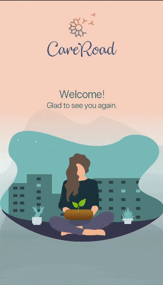
High — Fi Prototype. CareRoad
High-Fi Desirability test
-
100% of the users were able to complete the tasks.
-
Users felt the layout was clear and easy to understand. They also felt calm and happy to use the app.

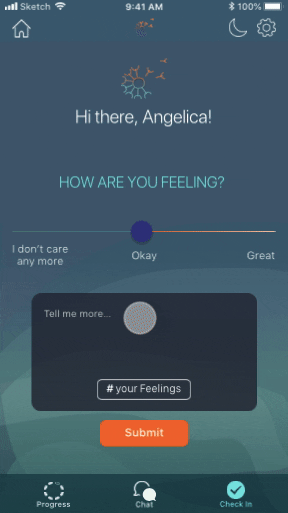
I initially used the Initial background (left) for the High-Fi, but 60% of the users said it made them feel calm but sad. Therefore, I tested two more options (Middle and Right) on an A/B experiment with the users, resulting in the Final background (Right) as their favorite one matching CareRoad’s attributes.
Get to know CareRoad… :)

Mood Tracker (left). Chat bot (right).

Share your progress.

Day and Night Mode.

Gardening — Daily activity tracker.
Here is a micro interaction made with Flinto, showing the users’ interaction with the mood tracker feature.
Conclusions
-
Immediate feedback is necessary for every task completed.
-
We need to guide the users to complete the tasks instead of counting on them to independently do it. Don't make the user think!
-
Testing our prototypes at any stage of the design process is crucial for a good user centered product design.
Next Steps
Some nice-to-haves:
-
On-boarding screens.
-
A user flow for secondary persona (Ex.: Therapist).
If developed, we would also like to monitor specific metrics, such as, app enrollments and increase of membership.