EVERYMUNDO
A usability improvement analysis created as a response to a design challenge for Ironhack’s final project.
EveryMundo is an airline Performance Marketing Technology company that offers products and technology-based services to help airlines improve brand visibility, marketing agility, user experience, shopping conversion, and reduce dependency on IT.
Problem
EveryMundo would like to provide usability improvements to its products, and they want start this with the airModules concepts. For this project our focus will be in two of their products, the monthly histogram and the low fare calendar. These modules offer a fare visualization and aim to help clients acquire even more qualified traffic.
Monthly Histogram
Summary: Describes route fares behavior in time. Lowest fare finder in the upcoming “x” amount of months for a specific route.
The goal set forth was to take the logic of their current functional design, and apply a re-designed experience.
Low Fare Calendar
Summary: Pricing airModule (web component) displaying lowest fares and route behavior in a calendar view, to quickly see when to fly to get the cheapest fares.
This module hasn’t been created so far, but is expected to be added to EM’s airModules portfolio in 2019. The goal set forth was to create a proposal based on research and user experience.
Objective
To provide UX/UI enhancements over existing and new airModules to increase conversions.
Hypothesis
We believe that if we provide usability improvements over existing and new airModules this will increase conversion rates, as users will be able to navigate easily through them and rapidly find the best deal.
Metrics
We will know we have succeed if :
-
Improve on shopping conversion
-
We reduce the time spent on that task
-
We see an increase on revenue
My role
As the UX/UI Designer, I worked with the product / project manager to better understand the nature of the problem. I will propose a re-design for the Histogram Module and offer a new design proposal for their low Fare Calendar Module, by using a rapid re-design process where identifying problems, pitching solutions, building prototypes, and running user testing occurred in a 2 week sprint.
Duration
2 week design sprint.
Competitive analysis
In order to understand EM’s current position in the market, I did a feature analysis. This tool helped me identify the weakness and strengths of our competitors to better understand what needed to be done.

Feature Analysis Chart
I researched different competitors and evaluated their interface within these modules. I was able to identified gaps in the market, such as full disclosure of the total price, that we can take advantage of and turn into an opportunity.
Then, I did a market positioning that helped me visualize where EM’s modules are and where we want them to be.

Market Positioning
Competitive analysis and Market positioning play an important role in designing and marketing strategies of many products. They helps us focus on improving upon what already exists rather than reinventing the wheel. Our product’s rank in the market helps reveal our strengths and weaknesses.
User-Centered Approach
Although the MVP (minimum viable product) for this project was clear since the beginning, to be able to improve usability on any product or service we need to do research and understand the user first. This would allow us to identify their pains and gains and take us out of the process for design. Therefore, in order to engage with this problem, I executed a design thinking approach that revolves around the user. This process involves Empathize (learning about the user for whom we are designing), Define (Redefining and focusing our questions based on our insights from the empathy stage), Ideate (coming up with possible solutions), Prototype (Build a representation of those ideas), and Test (test your ideas and get feedback from the user) in order to see what works and what doesn’t.

Design thinking
“Feedback is the heart of interaction. If user interaction is a conversation between your user and the product, then your product better participate in a friendly, interesting, and helpful manner.” (UXPin team)
Research
Quantitative Data
To empathize with the user, I conducted a survey in which I received 115 responses. I used social media outlets, such as Facebook and Reddit to post the surveys.

Statistics
Surveys were available in both English and Spanish because I wanted to include as much variety of audience as possible since EM’s products are offered world wide. Here are some interesting findings among the surveys.
Only 34% of the respondents start their search for an airfare at a specific airline.
About 98% travel between 1–10 times a year.
91% prefers a daily price comparison and a calendar view while looking for airfares.
Qualitative Data
In addition, to better empathize with the user I collected 7 interviews. During these interviews I conducted usability testing for the current Module being used by EM’s clients and our competitors'. This helped me identify the user frustrations and expectations.
People said:
“Finding the right airfare can take me days. I feel like I need to compare multiple sites at different times of the day to find the best deal.”
“I expect to see a clear and complete vision of my round trip since the beginning. I hate hidden fees.”
“When a website is overwhelming I rather go to other website and search for my airfare there. There are many options nowadays.”
Affinity Map
To analyze all this data and let it drive the process I created an affinity Map. The Affinity Map helps us categorize the findings into sections and define the main gains and pains of our users.

Pains
-
Hidden Fees.
-
Takes a long time to find a good deal.
-
Multi-site comparison.
Gains
-
Find the best deal.
-
No surprises or extra charges.
-
Spend less time looking for the right flight.
Affinity Map
User Persona
Following the user data, I synthesized the findings and to take us out of the research I created a user persona, Tiffany the traveler, who is a representation of our target audience.

User Persona
Tiffany is a traveler who always tries to find the best deals and lowest fares for her trips. She is a 30-year old professional who is passioned about traveling. She lives in a big and expensive city and her vacation days are limited. She always books her flights in advance to get the best price. She also tends to choose her destination based on blogs and pictures she sees on social media.
She often spends a lot of time searching for the right flight, and it becomes frustrating. She loves traveling with her favorite airline where she is able to accumulate miles for points, but she feels its website is difficult to understand and she never knows if she is getting the best deal; therefore, she feels the need to always compare to other sites.
Journey Map
To help us understand the full experience our user goes through while booking an airfare I created a Journey Map for Tiffany. This visual helps us identify problems and turn them into opportunities for design.

User Journey
Let’s start by looking at Tiffany’s Journey. Here we can visualize her feelings while looking for her airfare. Throughout that time she has multiple low points, such as no finding her destination on the deals page. But more important, we can observe that her biggest pain points appear when she can’t understand the layout for price comparison, and also, once she “finds a good deal” and continues to checkout, she discovers hidden fees.
Ideation:
At this stage of ideation we focused on coming up with answers and ideas for those gaps in EM's products. Therefore, I did a task analysis to identify our “how might we” questions and come up with ideas and possible solutions.

How Might We - Ideation Process
Being in the airline industry, usability was a major driving factor behind the re-design and design for these modules, with all the designs testing well above WCAG.
Prototype
For this project we focused our designs in two important aspects for our client and the user. First, our designs will be accessible following the Web Content Accessibility Guidelines (WCAG) 2.0 requirements. Second, they will be a Mobile First and Adaptive Design. The idea behind this approach is to create a consistent user experience across all devices, which in turn would make the web more user friendly in future iterations leading to happy users. When dealing with smaller screens, our designing focuses on usability and prioritize the most important aspects of the website.
Our main focus is to let the user drive our design; hence, for the lo-fi prototype of these Modules I sketched 3 different ideas for each of them and run a usability testing with an A / B testing experiment. Then, I let the 5 users pick their favorite version for each module.

Low — Fidelity Testing

Low- Fidelity — Usability testing results. Favorite versions picked by 5 testers.
Consequently, I designed two versions, for each of the previously selected layouts, in Mid- Fidelity. From there, I run again a usability testing with an A / B testing experiment with 5 testers resulting in one favorite for each Module.

Mid- Fidelity — Histogram Module
“I love that I can see everything in the same screen”
“I love having the two options (daily and monthly) for comparison at the same time.”

Mid- Fidelity — Low Fare Calendar Module
UI Design
Visual Competitive Analysis
The visual competitive analysis below compares elements for EM clients' competitors. I have included travel fare aggregators and travel fare metasearch engines, such as Momondo and Google Flights.
Visual Competitive Analysis - Histogram & Calendar
For this project, I used this analysis at two stages. First, for inspiration for my sketch in the Low- Fidelity prototypes. Last, transitioning from Mid-Fi to High Fi since this comparison helps us understand our users mental model.
Style Guide and High— Fidelity Prototypes
For the nature of this project and the guidelines provided by EM, this design process has the following visual settings restrictions:
-
Font Family
-
Colors Palette
-
Icons (by default Material Design Icons)
These aspects are independent to each airline because EM allows its clients to customize them based on their brand guidelines.
Therefore, I created a Style Guide for two of EM clients' sites that I will be recreating to represent the flow of the Modules and help you visualize the final design.
First, we will use AirEuropa’s website as an example to present our final design for the Histogram Module.

AirEuropa - Style Guide
And the high-fidelity…
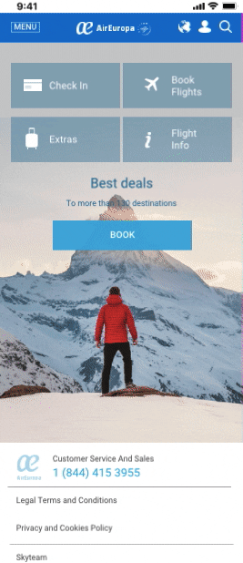
High- Fidelity Prototype Monthly Histogram- AirEuropa
Last, we will use Emirates’ site as an example to present our final design for the Low Fare Calendar Module.

Emirates Style Guide
And the high-fidelity…
High- Fidelity Prototype Low Fare Calendar - Emirates
Usability test results — High Fidelity (5 testers)
-
100% felt confident while completing the task.
-
Users felt the new layout was clear and easy to understand.
“I like that I can navigate to the right without missing the lowest price of the month.”
Here, I would like to give you a closer look for comparison between EM’s current mobile version of their Histogram Module and my new re-designed proposal.

EM’s current mobile version of their Histogram Module (Left). Re-designed proposal for EM’s Histogram Module (Right).
Designing for accessibility means designing for everyone. For instance, based on AirEuropa’s Style Guide, the price comparison line in their histogram would either be blue or green. If we were to focus on the idea that anyone will recognize the lowest price based on color, we would be excluding color blind people from our design (approximately 1 in 12 men and 1 in 200 women in the world are color blind). Therefore, for this design I did not relied solely on color for the lowest price representation, but I also added an identifying remark (see image above).
Conclusions and Next Steps
-
To achieve accessibility for your design, you must first understand the possible technical and physical limitations of your users.
-
To achieve usability, you must test at every stage of your design process.
-
The website’s flow is extremely important to measure the success rate for any module or feature.
Next steps would be to add more micro interactions for both modules, and if developed, monitor the conversion rate and time on task for each module to see if we succeed.
There is always room for improvement. Hence, further refine of the UI Design will always be a next step.